P.S. pls do not be offended by my comments and ratings cos they are extremely subjective :-p
~Liao Jiekai23rd june 2005~
FOREWORD
As I begin my trip on a journey to discover the myriads of pavilions and collateral events scattered all over Venice, I am excited... with a tripod on my back, a camera on my hand, a brain on my head * if i ever have one* i set out on a jouney to the west... west side of Venice I mean...
Play the glass ~ 4 stars
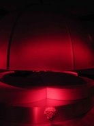
My first stop. Play the glass... an exhibition by a japanese artist. I think that this is an inspiring installation. Black glass. I mean... people in this world give their own definition of glass, pre-conceived qualities such as the glass being transparent/translucent, shimmering, reflective, pretty. The artist completely shatters these aspects of glass. Black, opaque, deformed bubbles. Can u imagine? I don't think so, until you can come down personally to feel it like I do. One simply can't tell that this black lump of matter is glass just by looking. But the truth is... it is...
the black and opaque ones
the black and shiny ones
Glass... moulding glass into environments. Putting a hidden shiny one amongst the opaque ones. Giving the glass fluid and living qualities, movement, fluidity, like plants growing towards sunlight. The artist had given "life" to these black objects.
Though the catalogue is expensive - 20 Euros, the smaller version which is rather comprehensive as well costs only 2 Euros. Best of all is the friendly gallery sitter who only charged me 1 Euros, because she don't have the change when I flash my 5 Euros note. Guess art is not all about money :-p
the hidden gem, this one is hidden in a secluded corner at the back of a staircase. One can only possibly catch it on their way down from the top level.
I enjoy this space, think that the artist not only brings in and exploits tje structure, hidden spaces, length of the house, he also put a video for ppl who wants to know how the glass is being made. Play with glass... indeed. And the chairs in the room look as if it is a glass ball too... except that it is soft and comfy. very conducive, I like it. well deserving 4 stars.
The nature of things: Artists from Northen Ireland ~ 2.5 stars
Hello??? I totally don't see the flow of the exhibition at all. Some works talk about politics, some about nature. Some were simply inconceivable. The structure of the exhibition is awkward. And the video pieces are simply too political for my taste. Some how i begin to think that discussing politics, or using art as propaganda is a trend in international exhibitions like this. Even the paintings aren't fantastic or exceptional. What a disappointment, to think I spend half an hour looking for this place, cos the location on the map is TOTALLY OUT. and the catalogue is an expensive as well...
New Zealand Pavilion ~ 4 stars
When I walked through the garden leading to the exhibition, I thought about the renowned beauty of New Zealand's landscape, I was greeted by a punch in my face. Industrial fences, crude ugly signboards, posters, noise, moving grey machineries, disgustingly confusing setup, metal, lumps of cement, whatever you can think of. For a while, i thought i stumbled into the film set of a mad scientist's home in universal studios... The artist had extremely successfully transformed this place into a junkyard/construction site. And this uniformity is seen not only in the work, the way the video is shown, also in their reception area, working area, as well as their browsing catalogues. It is successful in a lot of dimensions. I can totally engage with the entire space, this is what I call installation man! It strucks you in all 5 senses, I felt submerged, endangered, pierced, sliced... rammed... Though I don't exactly know what it is showing, there is something screaming in the veins of this place that struck me. As I left the pavilion, I know that I can never forget this work, this work is all about SENSATION :-p
Morocco Pavilion ~ 2 stars
Sorry... I think that the paintings are killing this space. KILLING... I say it literally, For goodness sake, these paintings all of different contrasting qualities are arranged on a systematic block format in a CATHEDRAL. Though i agree that there is not much space to play with... But it is still dull, boring and disappointing. This space do not deserve such treatment, neither do the paintings... The last time I see such arrangements are in silly art shows in ******* **** ( a s'pore shopping center). And this is the Venice Biennale!! However , I do like some of the paintings, there is this particular one by this artist who paints like S'pore landscape artist Thomas Yeo, I hope I get the name correctly, my art history stuff are slowing slipping out of my brains. And the gallery sitter from Arte Communications refuse to give me a catalogue, "For Press Only" she says... so sad... maybe after I get my Arte Comm pass, i go back to her again and try :-p
The Spectre of freedom: Taiwan Pavilion ~ 4.5 stars
This is it. The long awaited Taiwan Pavilion. As I climb the stairway, I was greeted by brochues, catalogues.... how generous of them! Before seeing the show, I went straight up to the gallery sitter to ask for the free bag. I need something to hold all that paper and brochures im carrying, and most importantly, I have seen far too many people carrying that bag around, I MUST have it!!! haha... showing the true colours of a KS Singaporean. The first works, 3 super 8mm animations. This is the first time I've seen 8mm works. The first one shows a torment, paradox of a headless person hammering repeatingly at this floating skull amongst a pool of water, I think it is talking about war, violence and liberation. The second one is a pretty surreal animation about war and nuclear bomb i think... not very sure, but it features characters from "Doraemon" as well as Hayao Miyazaki's " Tombstone of the fireflies", both my fav animae! So you can already see myt biasness revealing itself... heh. But I must say that the animation is brilliant, the artist did not win golden horse award for animation for nothing. yupz... lets proceed to the next one. This work is about an artist going on strike. De-Strike, it is named. It is a loud, interactive multimedia work, loud in the use of reds. They have these computer terminals for people to interact with the concept of going on strike. And they have webcams all over the room. Hope they did not record anything, or they will catch the KS singaporean taking a STACK of postcards and stickers... The next work is by a video artist, videos of him vommiting at different places, banging his head at different objects at different places, changing his clothes at different places, waving the race flag at different junctions, i don't know whether to call this clever or pure idiocy... but I am definitely amused by his videos. I didn't see the work of the 4th artist... missed him completely, only realised there is a 4th one when i reach home and read the free catalogue. But overall i must say that this exhibition had definitely lived up to it's name as one of the best shows around.
Afghanistan Pavilion ~ 3 stars
A very simple exhibition of 2 works. 1 video installation and 1 gallery of carpet/rugs or whatever u call it. I love the video of the woman painting the battered ruins white and then the back of the man white. I think it is a very powerful depiction, especially the setting of the video, the afghanistan landscapes, the dark skies, the sheeps running through the ruins... such subtlety... A very honest depiction of an artist from a war-torn kingdom.
Iran Pavilion ~ 3 stars
Another simple exhibition of 2 works. I like the work with the concrete cube hanging on 4 braids of hair at 4 corners. Simple portrayal of tension. Tension built up from simplicity.
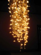
The second work is a bit awkward for me, Golden babies hanging on the ceiling with stylized shapes of mothers on the floor. Though the technical aspect of carving the scuplture babies deserve praise, but the concept is... "A" level art standard I think. It does not shows the maturity of a visual artist representing the nation in the Venice Biennale...
Ukraine Pavilion ~ 3.5 stars
Another very honest one man show. Powerful photographs from childhood contrasting with the complexities of a rioting video. The innocence of a man, a dream... a desired state of things. The video is about riots and protests, a simple 3 screen documentry about the interesting or even "less tense" moments in a riot.
Slovenian Pavilion ~ 2.5 stars
The artist attempts to depict the state of a room when light shines through the window on a 24 hour basis. Accelerated time 24 hours in mere minutes... artificial light created. I can't really follow what i see in the space, the environment shown in the catalogue is 20 times better than what I see. The ambience of light and space is so much more mild as compared to the pictures in the catalogue. I think that it can definitely be much better. And the small tiny catalgue costs a blasted 20 euros... unless i'm from the press of course...
Latvia Pavilion ~ 4 stars
Wow, I loved it! I enjoyed deciphering the story that is written backwards in the form of a hologram. I enjoyed the sense of fear and uncertainty when I am about to enter the dark room. The fear for the dark, especially after hearing the story. This whole work plays around the human psychology and the human mind. Interesting videos and environment. A super humongous "brain" in the center of a pitch dark room. Bump into it accidentally and i garantee u will scream if u have a faint heart. It seem to tell that there is something in every corner of darkness left to be seen, to be explored, to be uncovered. The exit is actually another entrance, if you walk through the exhibition from the "exit" u will get a different sensation, and hear the story when your journey ends. The fact that to anyone person coming to visit, there can only be one entrance and one exit, 1 experience, 1 sensation. What you choose is what u get.
Estonian Pavilion ~ 3 stars
Generally I only like one piece in this whole area. The "10 men" video. It portrays 10 men looking at the video camera and it is interesting as the video forms a basis of interaction between the men in the video and the audience. Every men have a secret, have something in their mind, and I feel something, every eye i observe, every expression I see, every motion that goes into my mind. Though the other works are not really very conceivable, the friendly gallery sitter gave me a free hard cover catalogue! cheers!
Republic of Cyprus Pavilion ~ 3 stars
I feel that I'm entering the Children's art Biennale. Though I don't really like the works and drawings as such, but in some ways, it is cohesive. It speaks something about connectivity. Is art only for those intellectually superior? Art should be something universal and a child's language is something most people have experienve before. The childish animations are simple but provocative. Welcome to the AGE OF INNOCENCE!
Turkey Pavilion ~ 3 stars
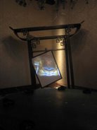
The video is... a bit to "teched" and futuristic for my appreciation. So let's just move to the sculpture parts. I have never seen sculptures being places in such dark environments before, and it gets me thinking.
Sculpture is not merely about the 3D object alone, but also how the environment interacts with it. And I feel that the context and space is beautifully presented. I like the space more than the sculpture or video.
Hong Kong Pavilion ~ 4 stars
Am I biased towards east asian countries? I realised that I gave all of them at least 4 stars. Maybe as a Chinese I can connect to them better.
I like the tea house made up of blue, white and red. for a moment I almost thought that I can pour hot water from the pot into the tea cup and drink. Maybe people do hallucinate when they are thirsty. Well thats besides the point... I realised that the tea leaves in the cups are actually strips of newspaper... disappointment. The adjacent installation signifies some sort of a pathway in a concrete sea. Not as photogenic as the previous, but this space got me thinking. As I climb and ascend the wooden structure, my sight is elevated to a different level, seeing different things, feeling a whole different space. Back to the first space, I felt that the position of the pavilion is rather strategic. Teahouse by the river, very "jiang1 nan2" huh?
Indonesia Pavilion ~ 3 stars
The works are "okay". Expressionistic paintings, video art encrypted with cultural and religious meanings, this is so "Indonesian", I mean they literally bring Indonesian art and put it on display in Venice. And this is a problem. They fail to realise the context, even the set-up is very casual, fleeting. The space is noisy, a lot of people walking about the surrounding areas. Some installation are nice, but the background space fail to elevate it. They should not have had the pavilion in the same building as a private school in the first place...
Argentina Pavilion ~ 4.5 stars
This work should have been 5 stars, if not for the location. I had so much trouble trying to find the Pavilion, it is too secluded and the path in is so littered with pigeon shit that it really turns me off. Okay that is besides the point. This work should have won the best national Pavilion. Okay maybe that's because I haven't been to Giardini and see the French one. But it is the best I had seen thus far. Perfect context, perfect ambience, perfect music, perfect execution, perfect concept. I couldn't criticize it because I like it so much.
A reflection of the ceiling mosaic in terms of an elastic jumping board. Haunting music and sound of a person jumping... yet there is no one there. Melancholic... mysterious... the sound form a basis of connecting the floor board and the ceiling. The old vs the new. The renaissance art vs the conceptual art. I totally admired the artist. It is haunting, captivating and contemplative. If only I had my video cam with me, But I think even a video camera cannot do justice to a work like this. One must be here to experience it.
Macedonian pavilion ~ 3.5 stars
Before I start this... allow me to make a side comment. ALL MOSQUITOES are to be CONDEMNED!!! As I was writing, there is this darned black pest injecting it's needle into me. Killed it in 3 attempts... a warning to all mosquitoes - do not underestimate the anti-mosquitoe abilities of a recce trooper, I have seen and killed too many of you, just get lost will ya :-p
Okay Mecadonia's work. Mozart's boat. A romantic and elegant name for a piece of wood that simply lived up to it's name. Boat that look like a violin, or violin that look like a boat? But the former seem much more suited because of the sheer size. Zhangyi??? Where art thou??? U must see this thing man.
A nice way to end my day. This piece is simple, straight forward, yet elegant and provocative. Cheers to Mozart! and his boat... and the catalogue is free :-p
Coming up next we have even more exciting reviews about the guggenheim, accademia art gallery and 4 other pavilions. Watch out for the next issue of RATINGS and REVIEWS: Venice Biennale 2005
iakeijiekai
23 june 2005


1 comment:
[b]WOMANs SUPERVIAGRA[/b]
[url=http://www.superviagraforum.kokoom.com/cials.html]BUY CHEAP VIAGRA + LOW-COST CIALIS & GET SPECIAL BONUS...[/url]
[b]TRATMENT IMPOTENCE[/b]
[url=http://www.medicforums.kokoom.com/impotence-advice.html]IMPOTENCE MEDICINE.BUY CHEAPEST VIAGRA[/url]
Post a Comment